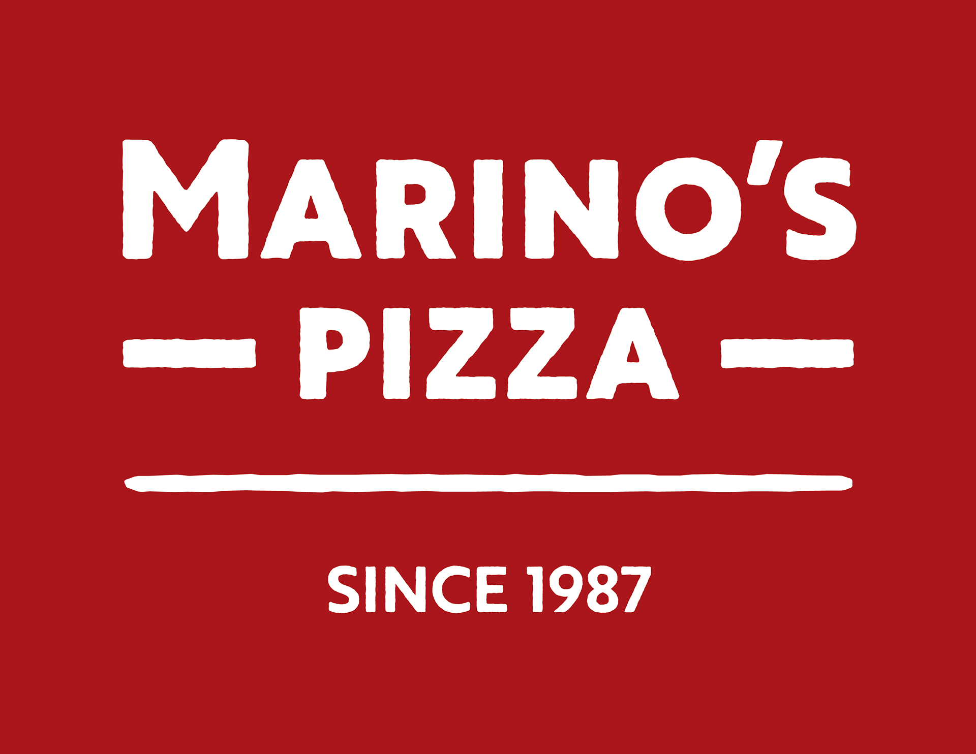
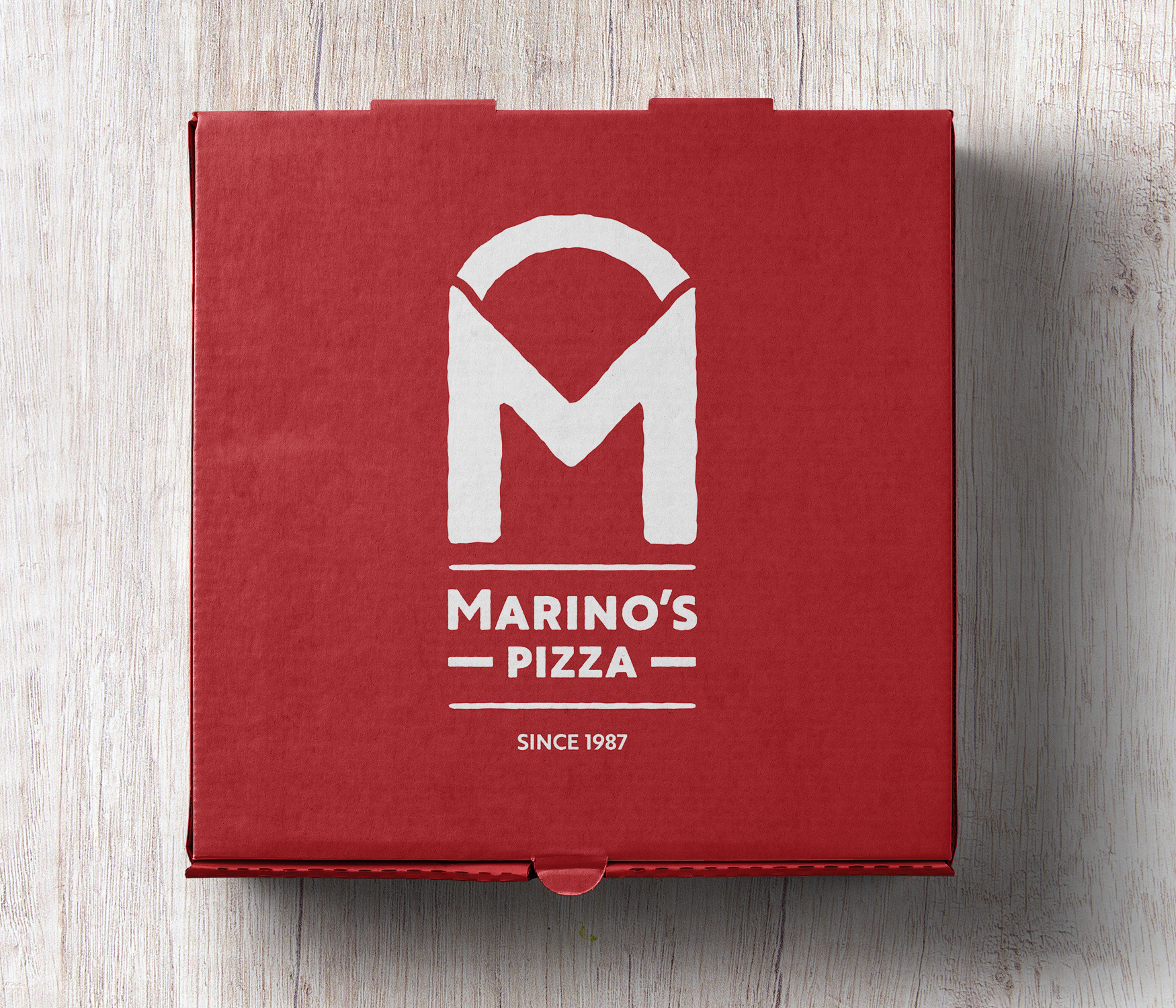
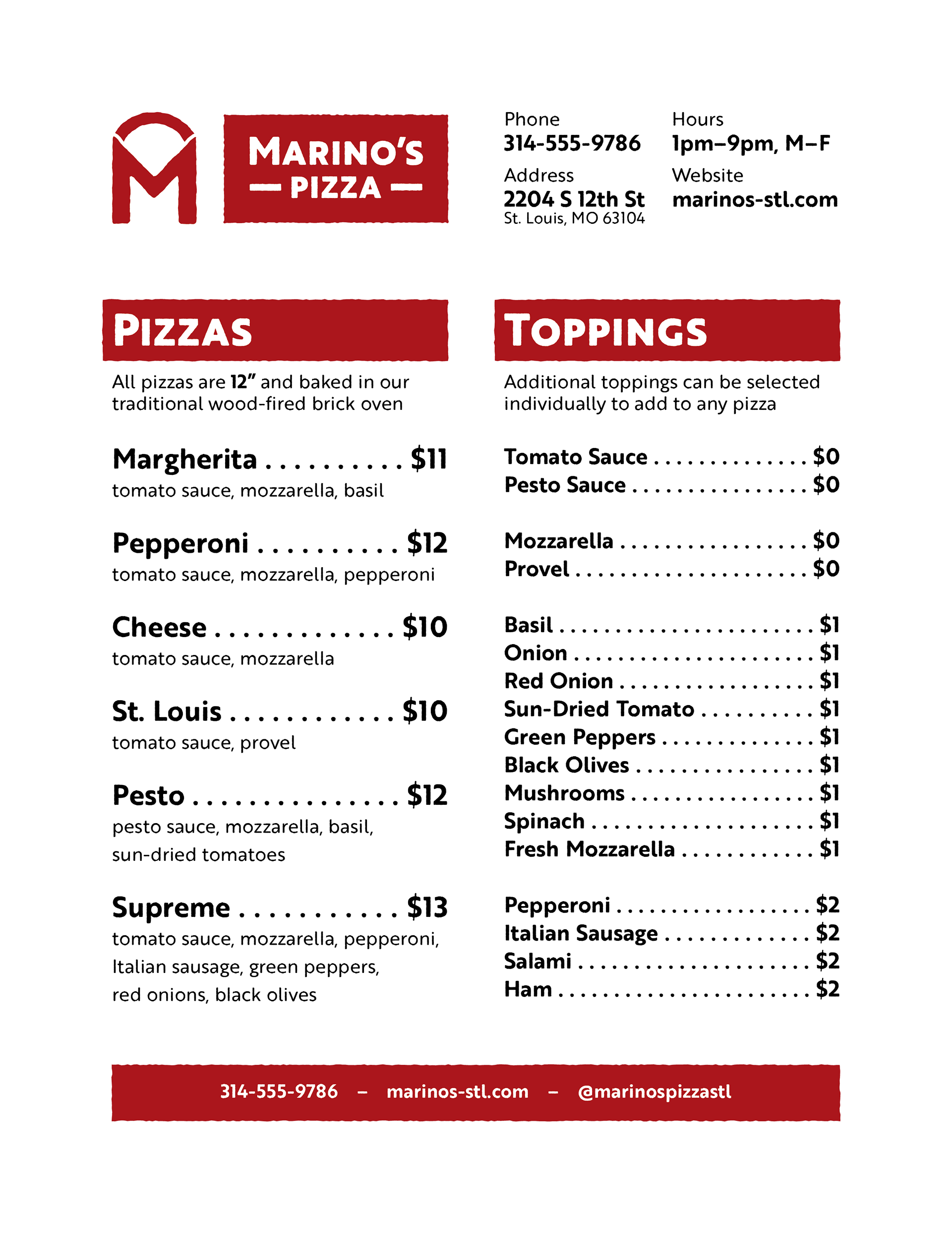
Restaurant Branding
Marino's is a local family restaurant in St. Louis that wanted to update their brand to attract new customers and appeal to a younger demographic. They wanted something that would blend a traditional, rustic aesthetic with a more modern appeal, and prominently feature the family name. The new logo combines the M of the family name with a slice of pizza, and the various brand elements all feature a rough appearance, suggesting the character of hand-made crust.